WPF 기초(XAML)
XAML
Arraging Elements
- Visibility
Visible — The element is rendered and participates in layout. (Layout O, 렌더링 O)
Collapsed — The element is invisible and does not participate in layout. (Layout X, 렌더링 X)
Hidden — The element is invisible yet still participates in layout. (Layout O, 렌더링 X)
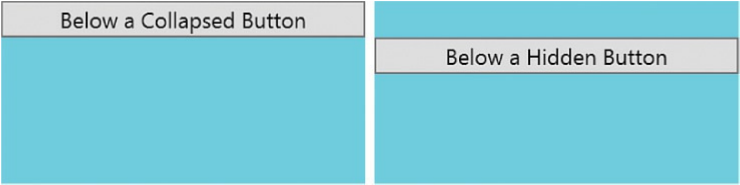
위 이미지를 보면 Collapsed, Hidden의 차이점을 알 수 있다.
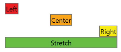
- Alignment
<StackPanel>
    <Button HorizontalAlignment="Left" Background="Red">Left</Button>
    <Button HorizontalAlignment="Center" Background="Orange">Center</Button>
    <Button HorizontalAlignment="Right" Background="Yellow">Right</Button>
    <Button HorizontalAlignment="Stretch" Background="Lime">Stretch</Button>
</StackPanel>
- Automatic Layout
- Canvas
- StackPanel
- DockPanel
- Grid
- VariableSizedWrapGrid/WrapPanel
1. Canvas
<Canvas x:Name="canvas">
<Button Background="Red">Left=0, Top=0</Button>
<Button x:Name="b" Canvas.Left="25" Canvas.Top="25"
Background="Orange">Left=25, Top=25</Button>
</Canvas>
Canvas.Left, Canvas.Top 으로 위치 조정을 함.
위치 조정은 Margin을 조정 하는 것 처럼 동작 한다.
Canvas.Right, Bottom 으로 동작 하며 Dock Right 를 기본값으로 Margin이 조정 되는것 처럼 동작.
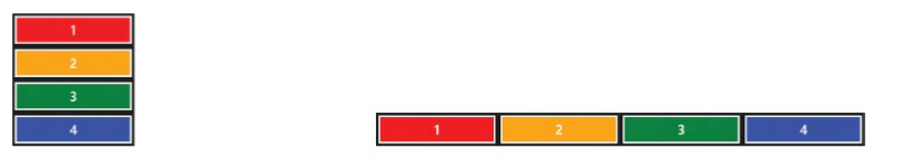
2. StackPanel
- 가장 많이 사용 하는 panel로서 동작이 간결 함.
- 이름에서 느끼듯이 순서대로 벽돌 쌓듯이 동작 하는 panel, 방향은
수평, 수직으로 정해 짐. - Orientation 속성으로 조정 가능하며, Horizontal/Vertical로 구분 한다.
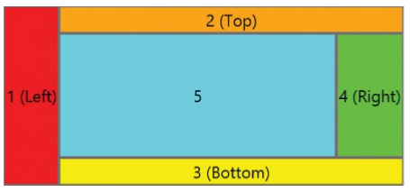
3. DockPanel
- DockPanel의 특징은 Panel Side 전체를 채울 수 있다는 점과, 남아 있는 공간을 전체를 Element를 채울 수 있다는 특징이 있다.
- Dockpanel은 LastChildFill 이라는 속성이 있는데 기본적으로 Default(true)로 셋팅이 되어있으며,이름에서 알수 있듯이 화면을 꽉채울 것인지의 속성 이다.
<DockPanel>
<Button DockPanel.Dock= "Top " Background="Red">1 (Top)</Button>
<Button DockPanel.Dock= "Left " Background="Orange">2 (Left)</Button>
<Button DockPanel.Dock= "Right " Background="Yellow">3 (Right)</Button>
<Button DockPanel.Dock= "Bottom " Background="Lime">4 (Bottom)</Button>
<Button Background="Aqua">5</Button>
</DockPanel>
4. Grid
- Grid는 다양하게 사용되는 Panel이며, Visual Studio 프로젝트가 Default로 Grid를 사용한다.
- Rows 와 Columns 를 배치해서 만들어 진다.
- 마치 HTML에서 Table이나, CSS Grid와 같은 구조이다.
그렇다면 Grid를 한번 실습 해보자.
<Grid Background="#1D1D1D">
<!-- Define seven rows: -->
<Grid.RowDefinitions>
<RowDefinition/> <!-- The area above the tiles -->
<RowDefinition/> <!-- Tile row #1 -->
<RowDefinition/> <!-- Tile row #2 -->
<RowDefinition/> <!-- Tile row #3 -->
<RowDefinition/> <!-- Tile row #4 -->
<RowDefinition/> <!-- Tile row #5 -->
<RowDefinition/> <!-- The area below the tiles -->
</Grid.RowDefinitions>
<!-- Define eight columns: -->
<Grid.ColumnDefinitions>
<ColumnDefinition/> <!-- Left margin -->
<ColumnDefinition/> <!-- Tile column #1 -->
<ColumnDefinition/> <!-- Tile column #2 -->
<ColumnDefinition/> <!-- Tile column #3 -->
<ColumnDefinition/> <!-- Tile column #4 -->
<ColumnDefinition/> <!-- The user's name -->
<ColumnDefinition/> <!-- The user's photo -->
<ColumnDefinition/> <!-- Right margin -->

 </Grid.ColumnDefinitions>
<!-- The "Start" text -->
<TextBlock Grid.Row="0" Grid.Column="1" FontSize="54" FontFamily="Segoe UI"
FontWeight="Light" VerticalAlignment="Center" Margin="0,0,0,26">
Start
</TextBlock>
<!-- The simulated live tiles -->
<Rectangle Grid.Row="1" Grid.Column="1" Margin="4" Fill="DodgerBlue"/>
<Rectangle Grid.Row="1" Grid.Column="3" Margin="4" Fill="Coral"/>
<Rectangle Grid.Row="2" Grid.Column="1" Margin="4" Fill="PaleVioletRed"/>
<Rectangle Grid.Row="2" Grid.Column="3" Margin="4" Fill="LimeGreen"/>
<Rectangle Grid.Row="3" Grid.Column="1" Margin="4" Fill="White"/>
<Rectangle Grid.Row="3" Grid.Column="3" Margin="4" Fill="DodgerBlue"/>
<Rectangle Grid.Row="4" Grid.Column="1" Margin="4" Fill="LimeGreen"/>
<Rectangle Grid.Row="4" Grid.Column="3" Margin="4" Fill="Yellow"/>
<Rectangle Grid.Row="4" Grid.Column="4" Margin="4" Fill="PaleVioletRed"/>
<Rectangle Grid.Row="5" Grid.Column="1" Margin="4" Fill="Tan"/>
<Rectangle Grid.Row="5" Grid.Column="3" Margin="4" Fill="DodgerBlue"/>
<Rectangle Grid.Row="5" Grid.Column="4" Margin="4" Fill="LimeGreen"/>
<!-- The current user's name and photo -->
<TextBlock Grid.Row="0" Grid.Column="5" FontSize="28" FontFamily="Segoe UI"
FontWeight="Light" HorizontalAlignment="Right"
VerticalAlignment="Center" Margin="0,0,8,28">
Adam Nathan
</TextBlock>
<Image Grid.Row="0" Grid.Column="6" Source="profile.png"
VerticalAlignment="Center" Stretch="None" Margin="0,0,0,26"/>
</Grid>
실행 결과
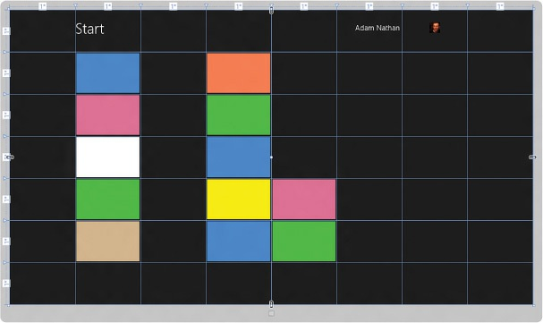
바둑판 처럼 영역이 나뉫것을 볼 수 있다.
Grid의 높이와 너비를 조절 할 수 있다.
<!-- Define seven rows: -->
<Grid.RowDefinitions>
<RowDefinition Height="180" /> <!-- The area above the tiles -->
<RowDefinition Height="128" /> <!-- Tile row #1 -->
<RowDefinition Height="128" /> <!-- Tile row #2 -->
<RowDefinition Height="128" /> <!-- Tile row #3 -->
<RowDefinition Height="128" /> <!-- Tile row #4 -->
<RowDefinition Height="128" /> <!-- Tile row #5 -->
<RowDefinition/> <!-- The area below the tiles -->
</Grid.RowDefinitions>
<!-- Define eight columns: -->
<Grid.ColumnDefinitions>
<ColumnDefinition Width="116" /> <!-- Left margin -->
<ColumnDefinition Width="128" /> <!-- Tile column #1 -->
<ColumnDefinition Width="128" /> <!-- Tile column #2 -->
<ColumnDefinition Width="128" /> <!-- Tile column #3 -->
<ColumnDefinition Width="128" /> <!-- Tile column #4 -->
<ColumnDefinition/> <!-- The user's name -->
<ColumnDefinition Width="40" /> <!-- The user's photo -->
<ColumnDefinition Width="46" /> <!-- Right margin -->
</Grid.ColumnDefinitions>
실행 결과
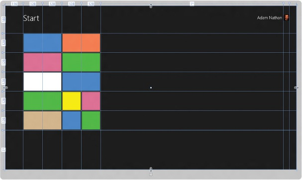
Grid의 Size를 변경하는 방법은 3가지 가 있다.
- Absolute Sizing
- AutoSizing
- Proportional Sizing
1. Absolute Sizing
Numaric Value(숫자)를 사용해서 Width, Height에 값을 설정해 준다. 이렇게 설정 해준 값은
Grid의 크기가 변해도 Column과 Row의 값은 입력되어진 값으로 유지된다.
2. AutoSizing
Row, Column 의 Hieght, Width 값을 Auto로 설정해 준다.
이렇게 설정된 값은 Cell의 내부 Control의 크기를 Defautl로 설정 되면, 내부 Control의 Contents의 길이에
따라서 크기가 결정된다. 예를 들어 TextBlock의 Text의 내용이 길어도 절대 잘리지 않는다.
3. Proportional sizing (sometimes called star sizing )
Row, Column을 비율로 조절 하는 기능이다.
Width, Height 의 속성에 직접 *, 2* 이런식으로 표현 할 수 있다. 아래 이미지를 보면, 사용하는 방법을 알 수 있다.
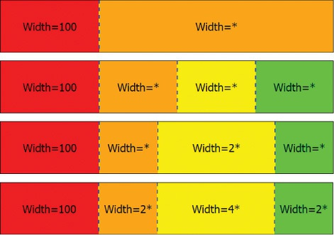
star sizing은 유용하게 사용될 것 같다.
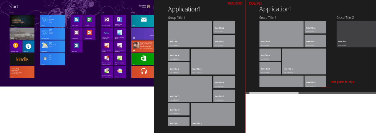
4-1. VariableSizedWrapGrid
VariableSizedWrapGrid은 UWP(Universal Windows Platform) 에서 사용 되는 control 이다.
아래와 같이 특정 Cell을 마치 엑셀을 병합 셀처럼 표현 해서 사용 할 수 있는 컨트롤 인것 같다. WPF에서는 사용 할 수 없는 control 이므로 사용할 일이 없을 것 같다. ㅠ ㅠ
<Image Source="Assets/01.jpg" Stretch="Fill" />
<Image Source="Assets/02.jpg" Stretch="Fill" Width="80" VariableSizedWrapGrid.ColumnSpan="2" />
<Image Source="Assets/03.jpg" Stretch="Fill" VariableSizedWrapGrid.RowSpan="2" />
<Image Source="Assets/04.jpg" Stretch="Fill" Height="80" Width="80" VariableSizedWrapGrid.RowSpan="2" VariableSizedWrapGrid.ColumnSpan="2" />
위 코드와는 상관 없는 이미지 입니다. 하지만 이런 식으로 사용된다는 것을 예제로 보여 드립니다.
4-2. WrapPanel
WrapPanal은 StackPanel 과 매우 유사 하게 동작 한다. 하지만 다른점이 있다. 당연히 다른점이 있으니까 control이 따로 정의되어 있겠지? ^^;
그렇다면 WrapPanel Vs StackPanel 의 차이점이 무엇인지 아래의 코드와 이미지를 한번 살펴 보자.
    <Grid>
        <Grid.ColumnDefinitions>
            <ColumnDefinition Width="679*"/>
            <ColumnDefinition Width="114*"/>
        </Grid.ColumnDefinitions>
        <StackPanel Orientation = "Vertical" Grid.ColumnSpan="2" HorizontalAlignment="Left"> //단순히 StackPanel Tag -> WrapPanel tag로 바꾸고 비교해 보았다.
            <TextBlock Text = "Fist Name" Width = "60" Height = "20" Margin = "5" />
            <TextBox  Width = "200" Height = "20" Margin = "5" />
            <TextBlock Text = "Last Name" Width = "60" Height = "20" Margin = "5" />
            <TextBox  Width = "200" Height = "20" Margin = "5"/>
            <TextBlock Text = "Age" Width = "60" Height = "20" Margin = "5" />
            <TextBox  Width = "60" Height = "20" Margin = "5" />
            <TextBlock Text = "Title" Width = "60" Height = "20" Margin = "5" />
            <TextBox  Width = "200" Height = "20" Margin = "5" />
            <TextBlock Text = "Fist Name" Width = "60" Height = "20" Margin = "5" />
            <TextBox  Width = "200" Height = "20" Margin = "5" />
            <TextBlock Text = "Fist Name" Width = "60" Height = "20" Margin = "5" />
            <TextBox  Width = "200" Height = "20" Margin = "5" />
            <TextBlock Text = "Last Name" Width = "60" Height = "20" Margin = "5" />
            <TextBox  Width = "200" Height = "20" Margin = "5"/>
            <TextBlock Text = "Age" Width = "60" Height = "20" Margin = "5" />
            <TextBox  Width = "60" Height = "20" Margin = "5" />
            <TextBlock Text = "Title" Width = "60" Height = "20" Margin = "5" />
            <TextBox  Width = "200" Height = "20" Margin = "5" />
            <TextBlock Text = "Fist Name" Width = "60" Height = "20" Margin = "5" />
        </StackPanel>
    </Grid>
</Window>
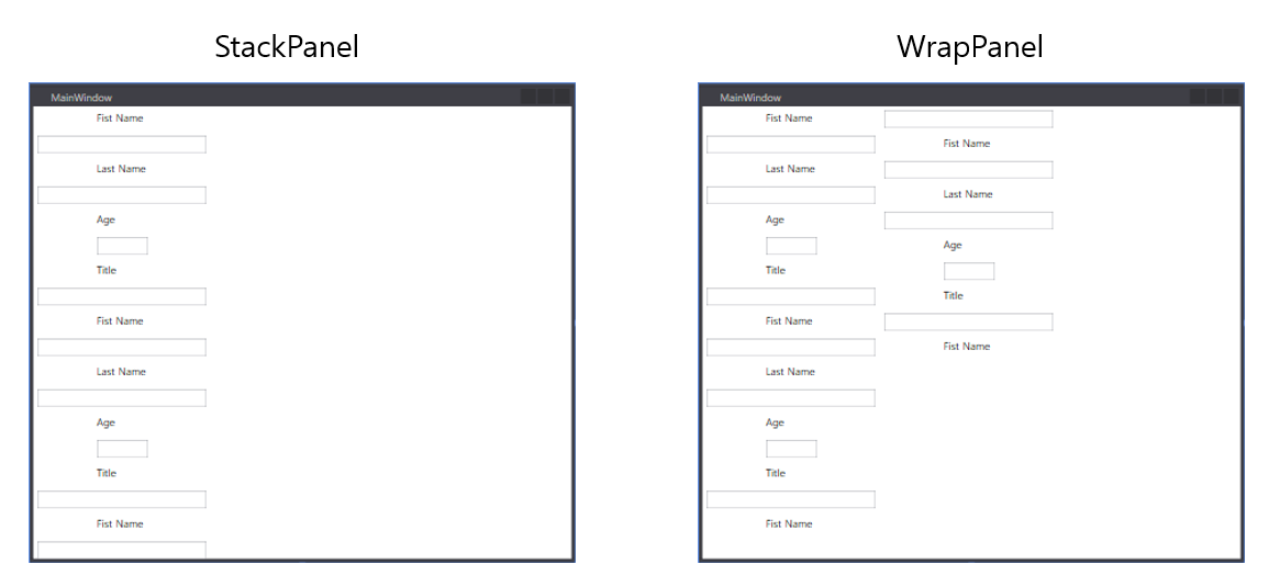
위 이미지를 보면 느낌이 딱!!!! 오시나요? 맞습니다. StackPanel은 남은 공간 여부에 상관 없이 무조건 정해진 방향으로 계속 쌓아 나가는 반면, WrapPanel은 공간이 부족하면 다음 공간으로 넘어가서
Element를 쌓아 나가는 것이 다르다고 할 수 있습니다.
Data Binding
Binding에 대한 간략 소개.
우리는 Binding에 대해 배우기 전에 먼저 Markup Extension이라는 개념부터 익혀야 한다.
Binding을 하기 위해서 필요한 개념이다.
Markup Extension이란 무엇인가?
기본적으로 Xaml Parser는 어떤방식 으로든 문자열을 기본 형식(type)으로 변환 할 수 있습니다.
하지만 우리는 이미 생성된 개체, 혹은 Static Object를 참조 할 경우가 있습니다.
또한 우리는 Default Constructor가 아닌, parameterized constructor 구문이 필요 합니다.
이것이 우리가 Markup Extension을 사용하는 이유입니다.
Markup Extension Syntax 는 어떻게 될까?
XAML 프로세스와 구변하는 구분은 중괄호
{}가 있다는 것이다.
우리는 앞으로 XAML코드에 중괄호{}가 있다면 Markup Extension으로 구분해야 한다.
- 아래의 간단한 예제를 보자
<StackPanel Orientation="Horizontal">
<!-- The user should type a username here -->
<TextBox Name="textBox"/>
<!-- This displays, "Hi, username!" -->
<TextBlock>
<Run>Hi, </Run>
<Run Text="{Binding ElementName=textBox, Path=Text}" /> //TextBlock에 TextBox.Text를 Binding
<Run>!</Run>
</TextBlock>
</StackPanel>
«TextBlock»의 Text는 Target Property, TextBox의 Text는 Source Property 로서 동작 한다.
Target Property : 일반 적으로 UI에 보여지는 속성으로서 최종적으로 변경되어지는 속성.
Source Property : 일반 적으로 Data 로서 Application 내부 로직으로 동작 하여 값이 변경.
그런데 우리는 아직도 Markup Extension에 익숙하지가 않다, 도대체 {} 안에 문자열들은
어떤 의미가 있으며 XAML은 어떻게 해석 하는 것인가?
아래의 간단한 이미지로 설명을 해보았다.
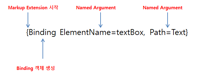
위 XAML 코드를 C# 코드로 바꾸면 어떻게 나타 낼 수 있을까?
var obj = new Binding(){ElementName=textBox, Path=Text};
//위와 같은 코드로 바뀔 수 있을 것이다.
이렇게 써놓고 보니까 XAML Extension 코드가 어느정도 이해가 갔다.
Binding’s RelativeSource
우리는 Element Name 말고 다른 방법으로 Source Object를 지정할 수 있습니다. RelativeSource 속성을 이용하는 것입니다.
댓글남기기